
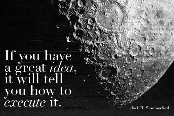
 From quotesondesign.com, graphic by me.
Showing posts with label MY WORK. Show all posts
Showing posts with label MY WORK. Show all posts
September 15, 2009
June 21, 2009

June 3, 2009
Color de México
 Created this logo for a new company, which brings authentic Mexican clothing to the states. Mostly concentrated in Mexican accessories, like pashminas, its mission is to showcase great authentic Mexican fashion in a very elegant way. I mainly wanted to focus, for this logo, on a fresh, crisp looking design. I opted for green, since Mexico can be well represented with this color. The typeface that I used was a Slab Serif, which to me I find it to be long lasting and adequate for a company that may expand into more than just fashion.
April 30, 2009
The Antonio Vivaldi Festival Poster
 This is a poster created for my Typography class, it called for creative use of the typefaces. I wanted to break apart from traditional opera posters, by giving it a more fresh, young look to it. The typeface I used was Myriad Pro, trying to break apart from Helvetica, and explore other sans-serif fonts. The color, also gives it a fresh and crisp look. By having all information off-centerd, it engages the audience, wanting to know more about it
February 6, 2009
Flight Tickets
 This were the invitations to my birthday dinner, I thought of something that would identify me and fun.
January 21, 2009
NEW NAME!

Graf was not quite working for me, so I decided to give it a new name. A little more geometric, streamlined and minimal.
January 10, 2009
Birthday Invitation

This is an invitation for my birthday party that I will be celebrating with family and friends. I tried to stay as simple as it can be, I felt there was no need to include the location or time (you can just say that when you hand guests the invitations). Very low key in design, but very intriguing to know more about it.
December 11, 2008

December 9, 2008

December 3, 2008

December 1, 2008
The New Pellegrino Label
 This is part of our package design project, I decided to reinvent the Pellegrino Mineral Water Label. I gave it an update, not to say that the original does not work, but a modern look to a classic identity. I am in the process of applying the label on to the bottle (mock-up) to give it a more realistic feel.
Skyline Jets Project


This is a continuation to the Direct Mail Postcard project (first blog entry) for Skyline Jets. I have applied the same design aesthetics as the postcard, in order to build an identity for the company. This website is composed by one home page and three other linked pages (Schedule, Contact and About)
November 22, 2008

November 18, 2008
Political Poster Project

In this assignment we were asked to create a poster political in nature, or a public service announcement of any kind. It was encouraged to make use of shapes and fonts. I decided to create a poster for a current situation that has affected our nation. Even though I am not politically inclined, the recession has affected me and many around me. My poster reflects the "circus" of the economic situation our nation is facing.
November 7, 2008
Thanksgiving Invitation

A traditional thanksgiving invitation with a modern twist. Inspired from Sofia Coppola's film, Marie Antoinette.
October 21, 2008
Photo Montage Project

For this project we were assigned to create a fictional space with two images. This image was intended to create the illusion of the luxury and sophistication of champagne. A very simple yet very elegant image.
Direct Mail Project


The objective of this project was to create a flyer for a company of our choice whose target was to promote their services to other business. I chose Skyline Jest, a private jet charter, which would advertise their services and why to choose them over commercial airlines. I worked with a modern, minimal design, very light in design, text and color. I also tried to mimic the many shapes of an airplane with the curved rectangles, very aerodynamic. The colors represent the sky and metal and chose to use a very light font (Helvetica Ultra Light)
We are also in the process of creating a website and brochure for our company using the same theme. More to come on this project...
Subscribe to:
Posts (Atom)